
Opened 15 years ago
Last modified 15 years ago
#73 closed defect (FIXED)
GNU MediaGoblin logo
| Reported by: | Jef van Schendel | Owned by: | Jef van Schendel |
|---|---|---|---|
| Priority: | minor | Milestone: | 0.2.0 |
| Component: | ui | Keywords: | |
| Cc: | Parent Tickets: |
Description
We need a great logo.
Attachments (4)
Change History (22)
by , 15 years ago
comment:1 by , 15 years ago
Jef van Schendel wrote:
We need a great logo.
What direction are you looking to take the logo? I mocked up something basic and cartoony. Any preferred style guidelines, possibly GNOME or Tango?
comment:2 by , 15 years ago
Thanks for starting this ticket. I've been giving this serious consideration. I also had a conversation with Bassam Kurdali about this over the phone on my lunch break today... let's see if I can type up those thoughts as fast as possible without going over on lunch ;)
So first of all, William I appreciate the general direction you're taking this, and it gave me a lot more thought of what could be done if we did go that direction. Currently it might be a bit problematic though, as the design looks very close to the current BSD logo, or maybe the GIMP's logo, etc.
I've been wondering a lot whether or not the original goblin I drew should be our logo or part of our logo or not. I really like him, but I'm not sure how well he fits in the upper left hand corner of our current design style, especially without possibly clashing with serious, non-cartoony work (I hate bringing this example up but it's such a good one, what happens if you have a serious picture of your grandparents' funeral?). But also in talking with Jon Phillips, he's pointed out that our current direction is fairly unique, interesting, and appealing with our goblin design. So I don't really want to drop it either.
What Bassam said on the phone really gelled with me: maybe our goblin should be our mascot, but not our logo. Look at McDonalds, which has both a mascot (Ronald McDonald) and logo (golden arches) as branding, but uses them differently. We could and probably should do the same thing: maybe the mascot belongs on some pages (maybe some welcome! and etc pages, more discussive introductory material type pages) and the logo belongs in the upper left hand corner and etc.
That doesn't get us any closer to knowing what our logo should be, but it's still useful to think about as in terms of branding, I think.
comment:3 by , 15 years ago
This conversation has moved on-list, but here's a summary of the last mail sent bridging some offline discussions onto the list.
I started a conversation offlist which was originally me reaching out to
Thorsten Wilms for some input and possibly assistance, and later
included a number of other people, and before I knew it we had a
conversation that was going offlist thar really should have been
onlist.  So here's my attempt to bring that discussion back on-list so
we can all discuss the future of awesome logo-ness.

First let me quote Thorsten on some points of guidance we should reflect
on, with some comments inline:

<thorsten_discussion>
> Maybe I can help with just some guidance.
>
> Who's your audience? (it often helps to think about who isn't your
> audience.)

 - Artists
 - Photographers
 - Amateur photographers just sharing family photos
 - Initially, probably more free-as-in-freedom type people, but I'd like
   to expand beyond that base
 - The type of people who want to post to flickr (and eventually
   youtube, etc)
 - People who want federation initially and know what the hell that means
 - I'm hoping eventually we can just be the best option and push
   federation to people who don't even know it's the best option.  How
   can we avoid getting entrenched in *only* the FaiF and federated
   people?  (Probably by just being the best, and also marketing outside
   of the FOSS circles until MediaGoblin is the obvious choice?)

Who isn't our audience?  Well I'm not sure.  Who isn't interested in
flickr / youtube type services these days?

> How will people learn about your project, what's your general strategy?

Our strategy is to first focus on FOSS'y type audience who want these
kinds of services.  I think this will be important because a) this is
the audience who really knows that this matters b) we need things to be
pretty well tested by an audience that can be forgiving about things not
being the best initially, which realistically they won't be (but then
will be!)

So we're going to simultaneously try and get as many people to run their
own instances as possible, but a few of us are looking at running a
large instance knowing that most people won't run their own.

> what will be the context of use?

The infrastructure is set in stone so we'll be able to handle multiple
media types (images, video, audio, ascii art, your deepest darkest bad
poetry in PDF format), even though we're only handling images so far.  I
think this will be a big feature... even though it's on the horizon.
Nobody else is providing an interface to do all these things that still
runs and works nicely.

That said, for now we're just targeting image galleries.  At the 0.1.0
public alpha there won't even be an API for mobile devices, but soon
after we'll hopefully get one.

Even though I think the content of DeviantArt is a bit too oriented
toward just cartoony, anime-ish type artwork generally, I admire the
kind of discussion and collaboration that happens there.  I'd like to
see that kind of coordination happen here, but across federated
instances.

> What do you want to say about the project, what's the desired image,
> your message? The desired tone (think of the seriousness of a bank vs
> the fun-factor of a travel agency, for example)?
>
> Analyze your competition in light of these questions.

First of all, we've got the name MediaGoblin.  I think it's kind of fun,
and I enjoy the silliness of it, but yes, I don't want it to interfere
too much with the type of content people put on here.  I've had a bunch
of conversations with Bassam Kurdali and Jef van Schendel about this.

Example cases of where the theme/logo applies to media being uploaded:
 - Something fun and fitting with a playful environment, like something
   you might see on deviantart
 - Pictures of a grandparent's funeral

Our theme actually went through quite a bit of adjustments to be able to
be okay for #2 actually, and I think we're doing okay for that, but back
to this.  So we've talked about having both a mascot and a logo, similar
to the way that McDonalds has both (Ronald McDonald and the Golden
Arches) but uses them in different situations.  Similarly on most parts
of the site the mascot might not come into play but in certain parts or
promotional materials maybe it will.  It certainly won't be there for
peoples' images or galleries, but maybe it will on the registration page
or the about us page.

But back to what we want to say.  I actually really admire Google in
this regard.  Google's brand has generally been recognized as playful
and fun, but never seems to get in the way of people being serious.
Nobody says "Don't use Google, that's not for serious searching or
work."  I'd really like to have that same balance for our project if
it's at all possible.

> The logo should be a defining part of your visual identity. You might
> want to handle the look of your project pages and that of your product
> differently. Because the later will have to serve as context, almost a
> canvas, for user-provided media. You might want to make it very calm,
> neutral, minimal because of that. A logo that resembles a head or face
> might be a problem, then, attracting too much attention. The project
> pages could afford to be bolder.
>
> Independent, or maybe even in spite of such considerations, the first
> priority of the logo is to be recognizable as a specific symbol, so it
> can stand for the project similar to how a name does. The true meaning
> of the logo will come from what it stands for and the connection is
> established in context.
>
> The second concern is general attractiveness, the impression of
> balance and control. Only then should you care about symbolism.
</thorsten_discussion>

Lastly, a couple of other points:

 - We currently have that "eye in the media" design but everyone seems
   to agree that it isn't quite enough.
 - We almost cerainly won't have GNU in the logo, though we'll continue
   to advertise ourselves as a GNU project. (Not unusual, see
   http://lists.gnu.org/images/mailman/mailman.jpg )
 - We'll probably separate out our mascot from our logo... see above
   for discussion on this
 - Aside from this, we don't really know!

I guess the next step is to start working on some mockups that reflect
the discussion above.
comment:4 by , 15 years ago
Hi there,
I'd been playing around with doing a vector version of the Goblin character - somewhat blind to this thread, so please take the image lightly :) - it probably falls more inline with the mascot side to things.
It should also be noted that I feel the attached image is about 60% complete from where i'd like to see it, and requires polish. But it would probably be better to get feedback at this point before doing that, if you think it might be at all useful.
comment:5 by , 15 years ago
| Milestone: | 0.0.3 → 0.0.4 |
|---|
Retargeting at 0.0.4. We should try to get a logo, or something close to the final, by the end of the month.
comment:6 by , 15 years ago
| Milestone: | 0.0.4 → 0.0.5 |
|---|
We release 0.0.4, so I'm bumping this to 0.0.5.
comment:7 by , 15 years ago
Hi there,
Attached is a vercotized version of the logo of the top right of the 'logo_derivatives' image, with ears skewed more towards the third from the top on right and 404 page image...
Please let me know if you'd like to see some changes,
- Jarred
comment:9 by , 15 years ago
I've experimentally committed something that combines Thorsten's handwritten text from http://thorwil.wordpress.com/2011/07/25/media-goblin-logo-3/ with the SVG rendering of the logo Jarred submitted. :)
comment:10 by , 15 years ago
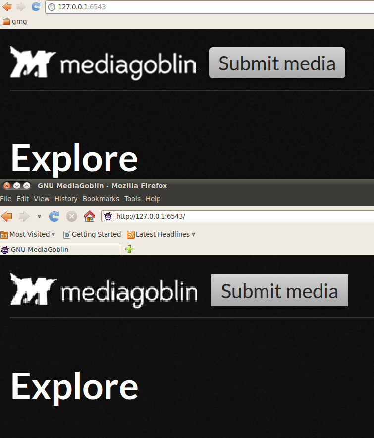
I'm getting this extra "-" between the logo/MediaGoblin and the
submit media button. It is there in chrome but not in firefox. This
isn't the first time I've seen it, but I can't recall if it's gone
away in the meantime. If I still see it after this issue is closed
I'll open a new one.
-
http://i.imgur.com/RdJiZ.png
comment:12 by , 15 years ago
I'm still seeing 832751, "Experimentally putting logo in place," as the latest gmg/master commit. Am I missing something?
comment:15 by , 15 years ago
| Milestone: | 0.0.5 → 0.1.0 |
|---|
comment:16 by , 15 years ago
| Milestone: | 0.1.0 → 0.2.0 |
|---|
comment:15 by , 15 years ago
| Status: | New → Closed |
|---|
So not much as in terms of updates on the bugs, but we did plenty elsewhere.
Basically in the end we ended up using Thorsten's text for the logo and decided that actually looked best.
Thorsten says he's happy with the state of his logo also, and so I'm closing this ticket.
comment:16 by , 14 years ago
The original url for this bug was http://bugs.foocorp.net/issues/358 .
wip.svg