Opened 6 years ago
Last modified 5 years ago
#5619 new enhancement
Modernise gallery listings
| Reported by: | Olivier Mehani | Owned by: | |
|---|---|---|---|
| Priority: | major | Milestone: | 0.13.0 |
| Component: | programming | Keywords: | |
| Cc: | Parent Tickets: |
Description
The gallery looks a bit old and clunky.
It would be nice to refresh it a bit, with less whitespace more room for the thumbnails, and a more dynamic/responsive layout taking into account size of the various thumbs, as well as that of the container window
Attachments (7)
Change History (9)
by , 6 years ago
| Attachment: | 0001-Generalise-keyboard-navigation.patch added |
|---|
by , 6 years ago
| Attachment: | 0002-Modernise-gallery.patch added |
|---|
by , 6 years ago
| Attachment: | 0003-Override-skeleton-s-container-size-for-better-respon.patch added |
|---|
by , 6 years ago
| Attachment: | 0004-Split-media_grid-out-to-its-own-util.patch added |
|---|
by , 6 years ago
| Attachment: | 0005-Use-media_entry-in-collection_gallery.patch added |
|---|
by , 6 years ago
| Attachment: | Screenshot from 2020-05-31 00-38-07.png added |
|---|
by , 6 years ago
| Attachment: | Screenshot from 2020-05-31 00-37-58.png added |
|---|
comment:1 by , 6 years ago
comment:2 by , 5 years ago
| Milestone: | → 0.13.0 |
|---|
I don't know why I missed these patches Olivier. My apologies. I'll take a closer look at them soon. Could potentially be a good opportunity to make use of CSS grid.

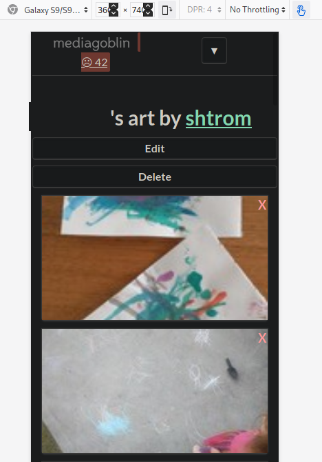
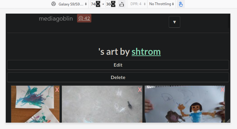
Ok, here's an attempt at modernising the gallery. The code should also be available from
https://scm.narf.ssji.net/git/mediagoblin/log/?h=5619-modern-gallery
And some screenshots

