
Opened 15 years ago
Last modified 15 years ago
#319 closed defect (FIXED)
Resend verification mail button looks weird with long text
| Reported by: | Inconexo ø | Owned by: | Jef van Schendel |
|---|---|---|---|
| Priority: | minor | Milestone: | |
| Component: | ui | Keywords: | |
| Cc: | Parent Tickets: |
Description
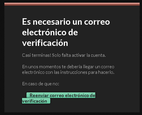
Doing the registration process, the resend button seems to be cutted in two lines. I don't know if it's because spanish text is too long or my resolution is too low (1024x768). Not a big deal, but FYI.
Browser: Iceweasel (Firefox) 8.0
Attachments (1)
Change History (4)
by , 15 years ago
| Attachment: | weirdResendButton.png added |
|---|
comment:1 by , 15 years ago
| Component: | → Graphic Design / UI |
|---|---|
| Owner: | set to |
Yep. This problem has actually turned up before (the two buttons on the homepage also tend to do this). It's because the buttons are simply styled links.
This can be fixed by giving them a display: inline-block. However this shakes up the margins and thus position a bit, so I'll need more time to fix the little bugs this change will cause.
Assigning to me.
comment:2 by , 15 years ago
| Status: | New → Closed |
|---|
Closing this ticket because it's fixed. Instead of breaking, a really long button while now grow in size.
Note:
See TracTickets
for help on using tickets.
weirdResendButton.png